Colors
Just like the logo, a brand’s colors play a crucial role in recognition and consistency. Captain follows a specific color palette with clear guidelines.
Usage
The core brand colors are white, grey, bright turquoise and dark green. When combining multiple colors in a design, avoid weak contrasts. Neutral tones help maintain balance and readability.
Bright turquoise is reserved for actions and key highlights. Use it sparingly to ensure it stands out when needed.
White
#FFFFFF
Grey
#CBD2C6
Light grey
#E5E9E4
Bright
Turquoise
#35FCD6
Dark Green
#04332A
Don'ts
Our colors and gradients must always be applied consistently and correctly. Below are a few examples of what should be avoided.
Do not use gradients, only when using the circle element.

Do not use dark green as a background. Only use white, grey or tuquoise.

Avoid using black, instead use dark green

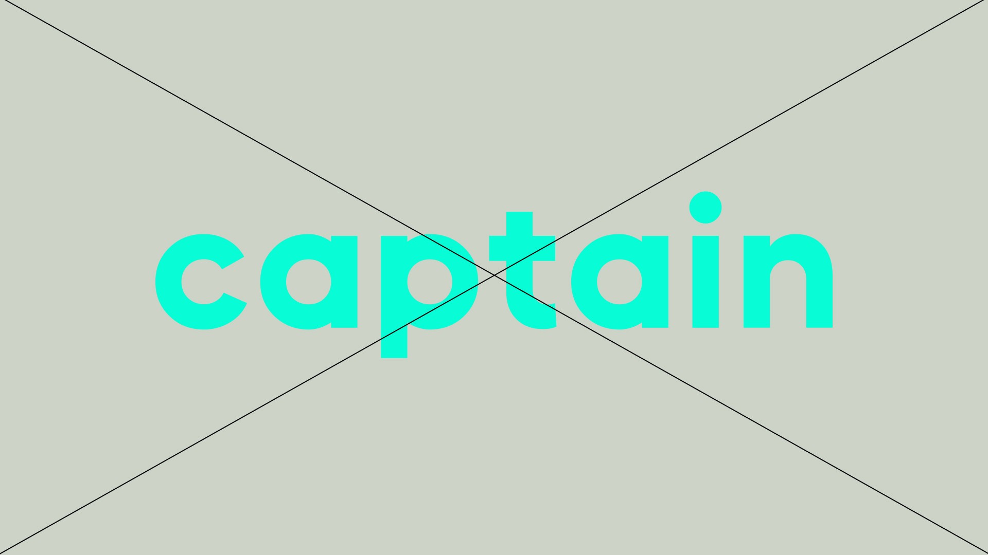
Make sure there is enough contrast.
Examples
