Logo
The logo of Captain is one of the most important elements of our brand identity. By keeping consistent white space, proportions, placement, and use of color, our logo remains recognizable in every presentation it appears in.

Variants
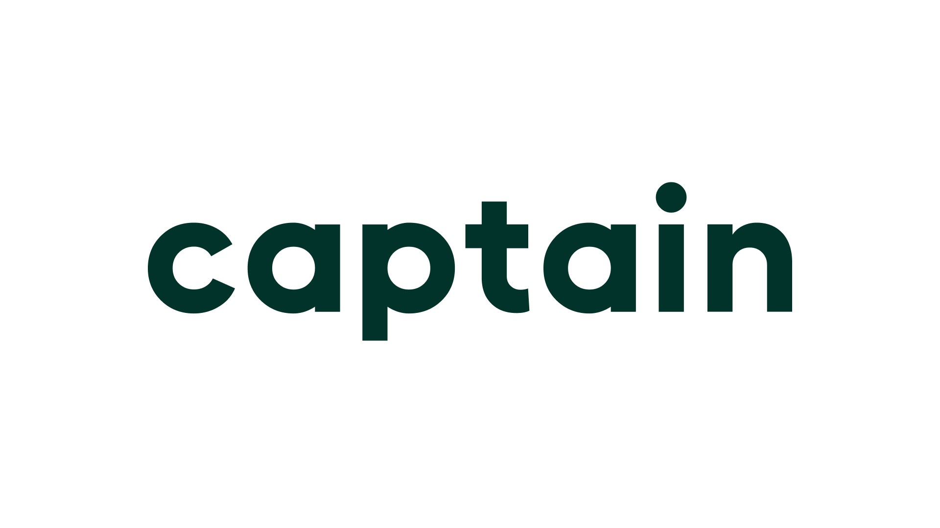
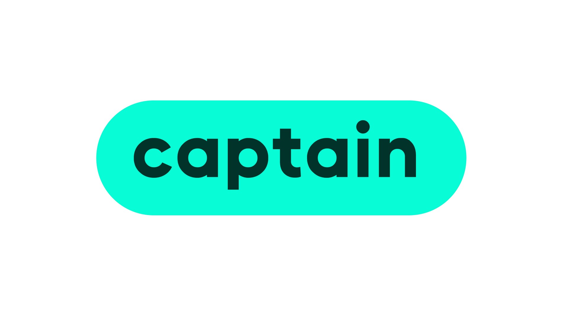
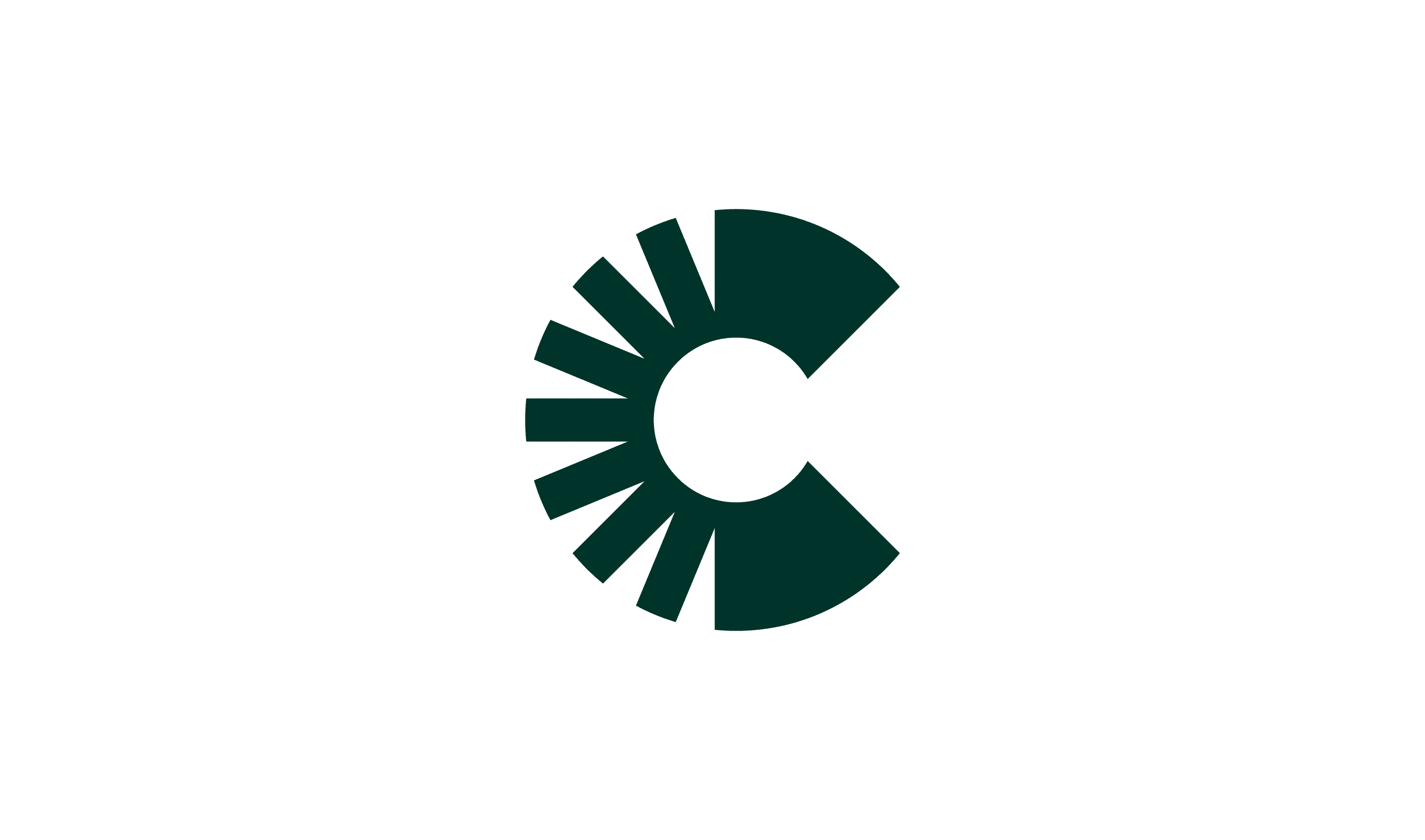
At Captain, clarity and consistency are essential. The logo comes in two variations: a wordmark and an icon, which should never be used together.
The logo color depends on the background to ensure maximum visibility. On light backgrounds, the logo should always be dark green, while on darker backgrounds for example: images, it should be white. If the logo is placed over or a complex background, it should be positioned within a pill-shaped background to maintain contrast and readability.
Following these guidelines ensures a strong and consistent brand identity across all applications.
Primary logo
Secondary logo
icon
Usage
Decide for each application whether it’s better to use the logo or the icon.
For example:
Use the Wordmark logo for larger formats, such as presentation slides, social media or prints.
Use the Icon for smaller formats like an app or profile picture.
Pay close attention to size and contrast to ensure functionality and readability. The logo and surrounding elements should not feel identical in hierarchy. Proper contrast and spacing will help the design remain clear and professional.
Clearspace
Clear space is the required amount of space around a logo to maximize its visibility and impact. To determine the minimum clear space, reference the logo's x-height when placing it in layouts or by neighboring elements. The x-height is measured from the type’s baseline to the top of flat lowercase letters, like the letters a, i, and n.

Placement
Typically, we place the logo in the bottom-right and bottom-left corners of the layout. The top-right, top-left, and center positions are also available placements if the layout or composition calls for it.

Scalability
When scaling the logo, always ensure the legibility is not compromised.
Minimum size
On screen:
Logo width is 60 px
On print:
Logo width is 20 mm

Don'ts
The logo should always be treated with care and appear consistently across all surfaces. It must never be redesigned, altered, or modified in any way. By following these rules, the logo will maintain its professional and recognizable appearance. Below are some examples of what not to do to ensure consistency:
Only use the logo in white or dark green

Do not place the logo on busy or low-contrast backgrounds

Do not add shadows, gradients, or any other effects to the logo

Do not stretch, distort, or resize the logo disproportionately

Do not use the logo on top of a person's face

Do not use the logo on top of a person's face

Examples


Downloads
Click the button below to download the logos.
Use EPS files for print materials.
Use PNG of SVG files for digital media.
Can’t find what you’re looking for?
Send an email to hello@offff.studio for assistance.

