Graphic elements
Our branding system consists of various elements that together ensure the recognizability of our brand. In addition to the logo, typography and other brand assets, our graphic elements complete the brand identity.

The shapes
Captain’s signature shapes are core design elements that bring structure, movement, and consistency to the brand’s visual identity. These curved forms come in different variations, including dotted, segmented, and gradient-filled styles, allowing for flexible applications.
The elements
Captain’s graphic elements are designed to create a seamless and recognizable interface. When designing new UI items, it is important to use the existing buttons, shapes, and elements from the brand’s system to maintain consistency and clarity.
Use predefined components such as buttons, cards, and containers rather than designing from scratch. Maintain spacing and alignment to ensure readability and a clean visual hierarchy. Apply the brand color palette—dark green, white, bright turquoise, and gray—to reinforce brand identity. Ensure contrast and accessibility by following the correct color usage rules.


Improper Usage
Captain’s graphic elements should always be treated with care and appear consistently across all surfaces. They must never be redesigned, altered, or modified in any way. By following these rules, the graphic elements will maintain a professional and recognizable appearance. Below are some examples of what not to do to ensure consistency:
Don't zoom in too far into the element

Don’t use more than one element in a single design.

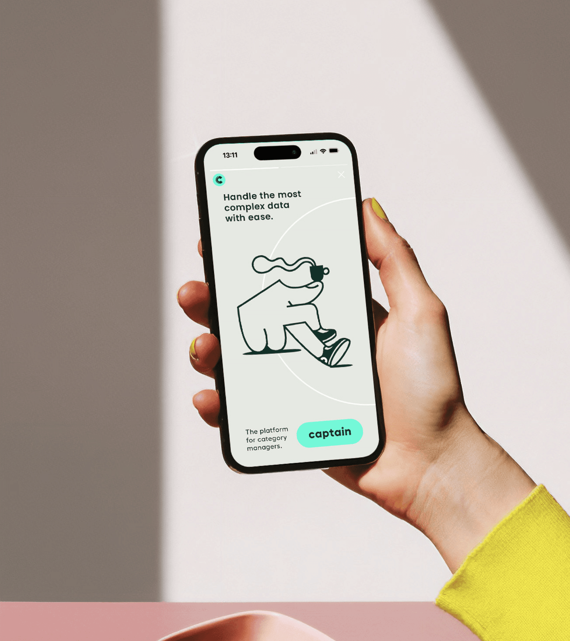
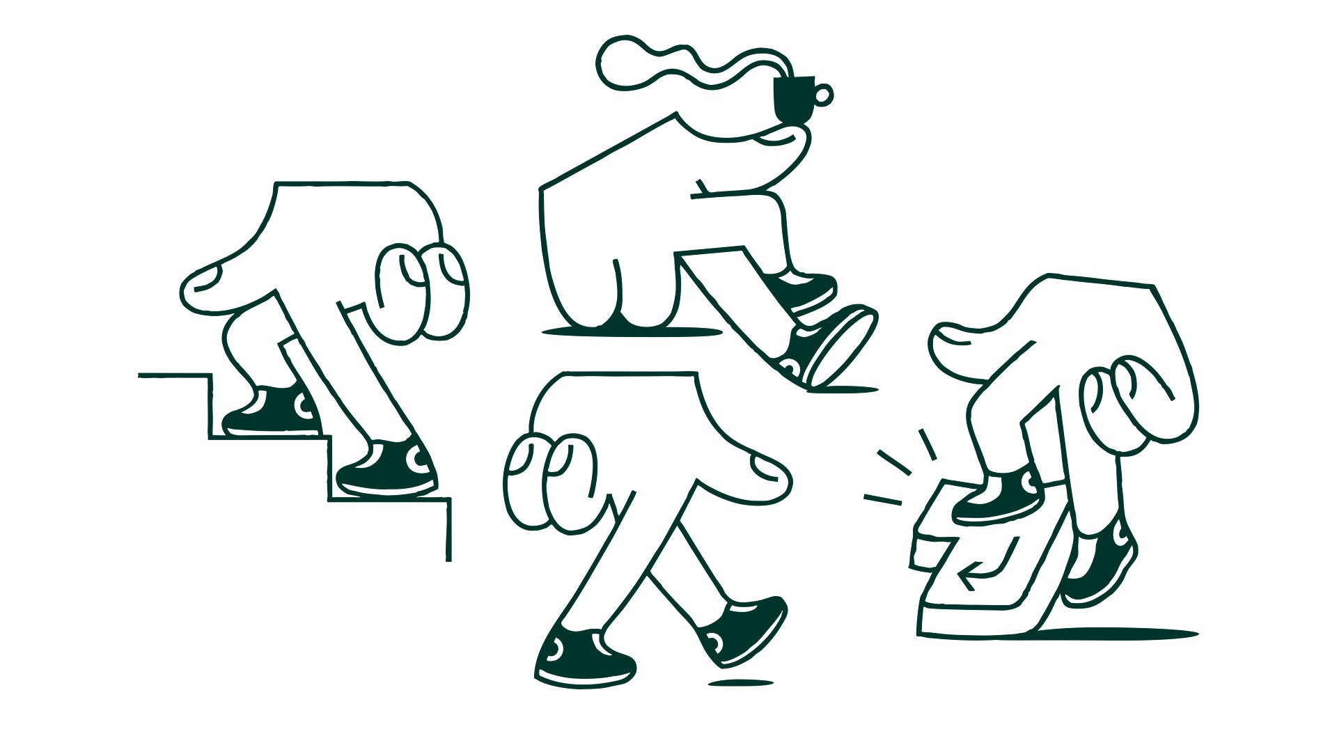
The Mascot
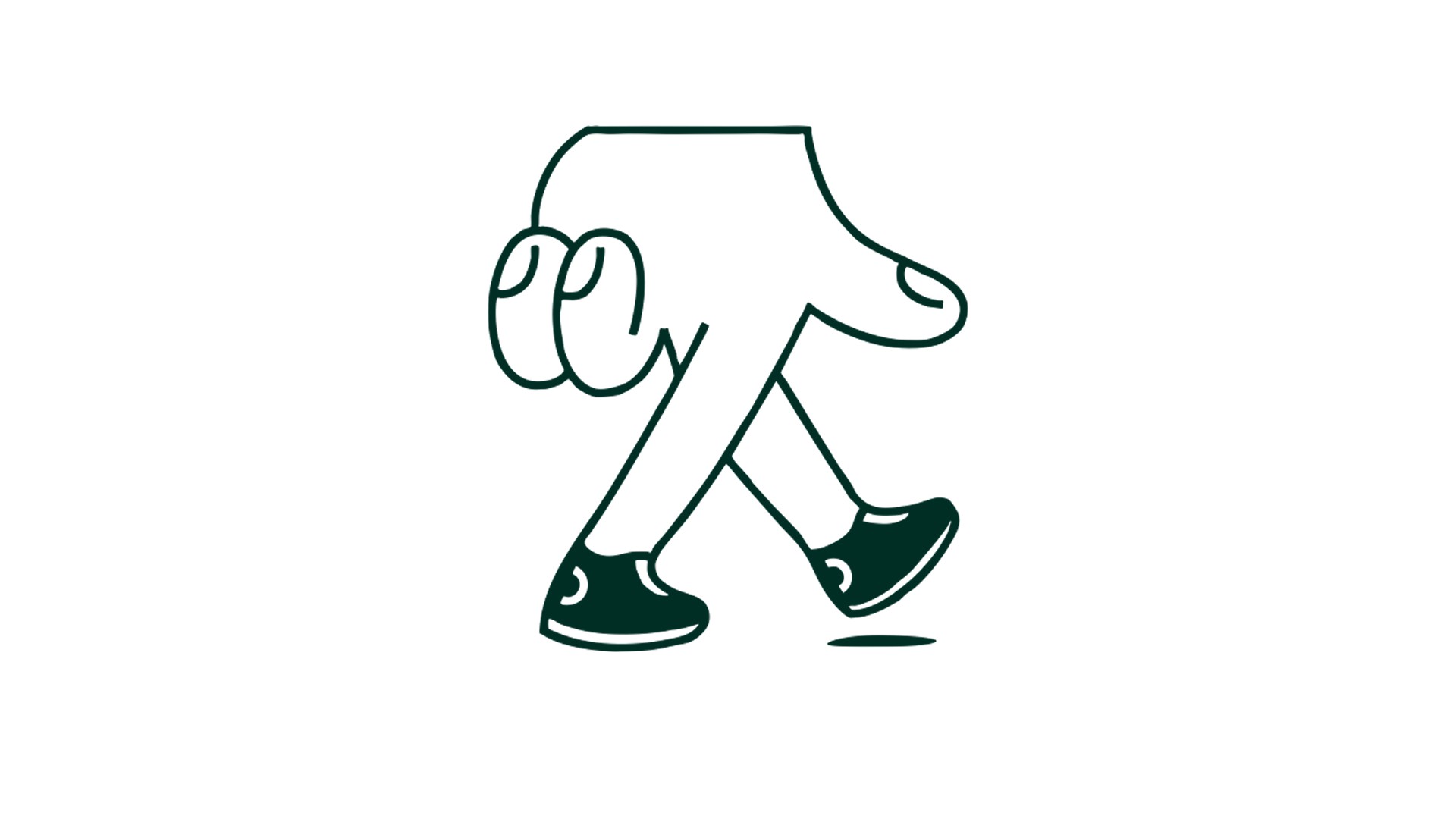
Captain has a set of predefined mascots designed to enhance the brand’s personality. These mascots are carefully created to align with Captain’s visual identity. Each mascot is a finger figure with shoes, holding a specific pose to convey different moods or actions.
It is important to use only the official mascots provided. Do not create your own variations or alter the existing designs. Consistency in mascot usage helps maintain a cohesive and recognizable brand image.
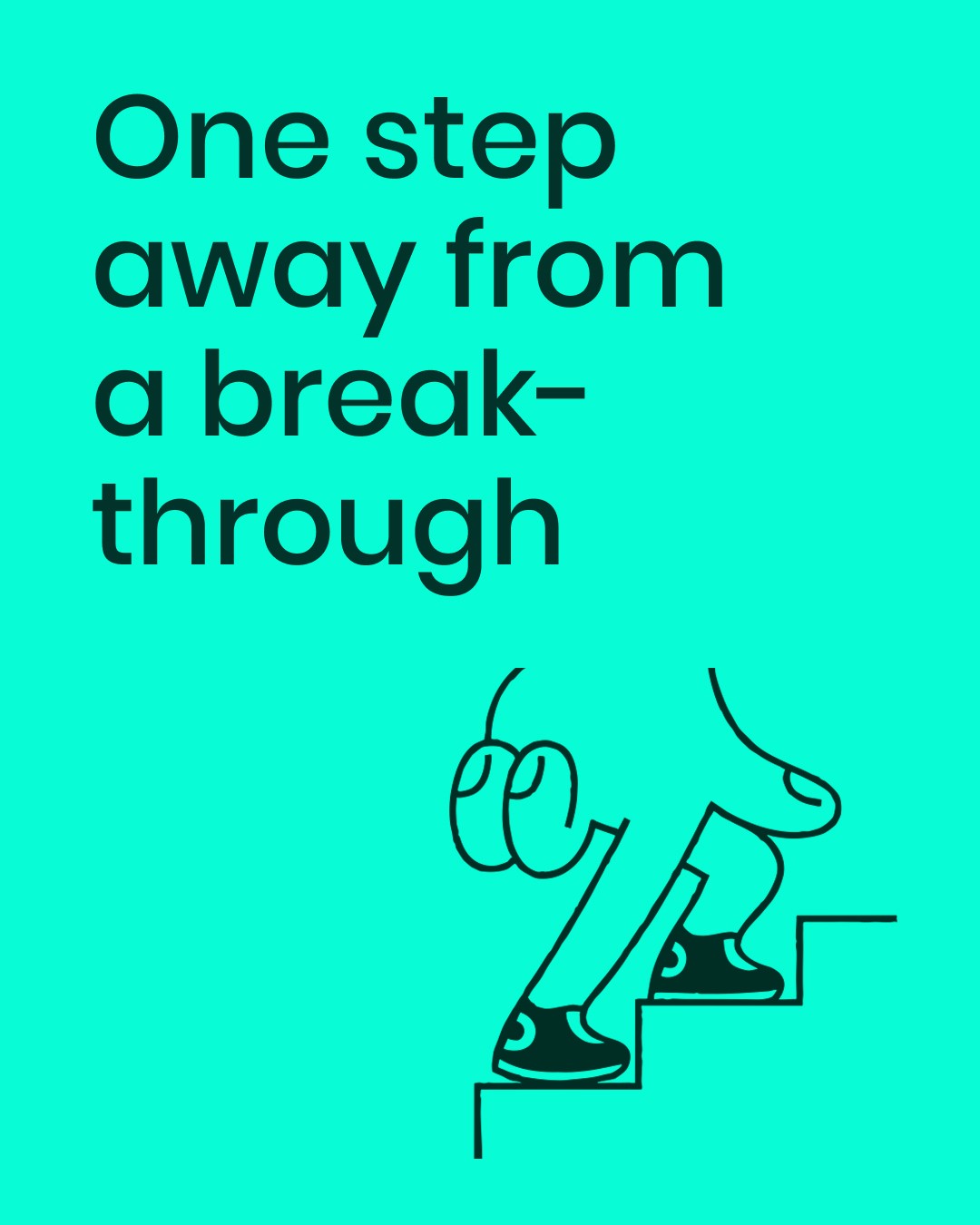
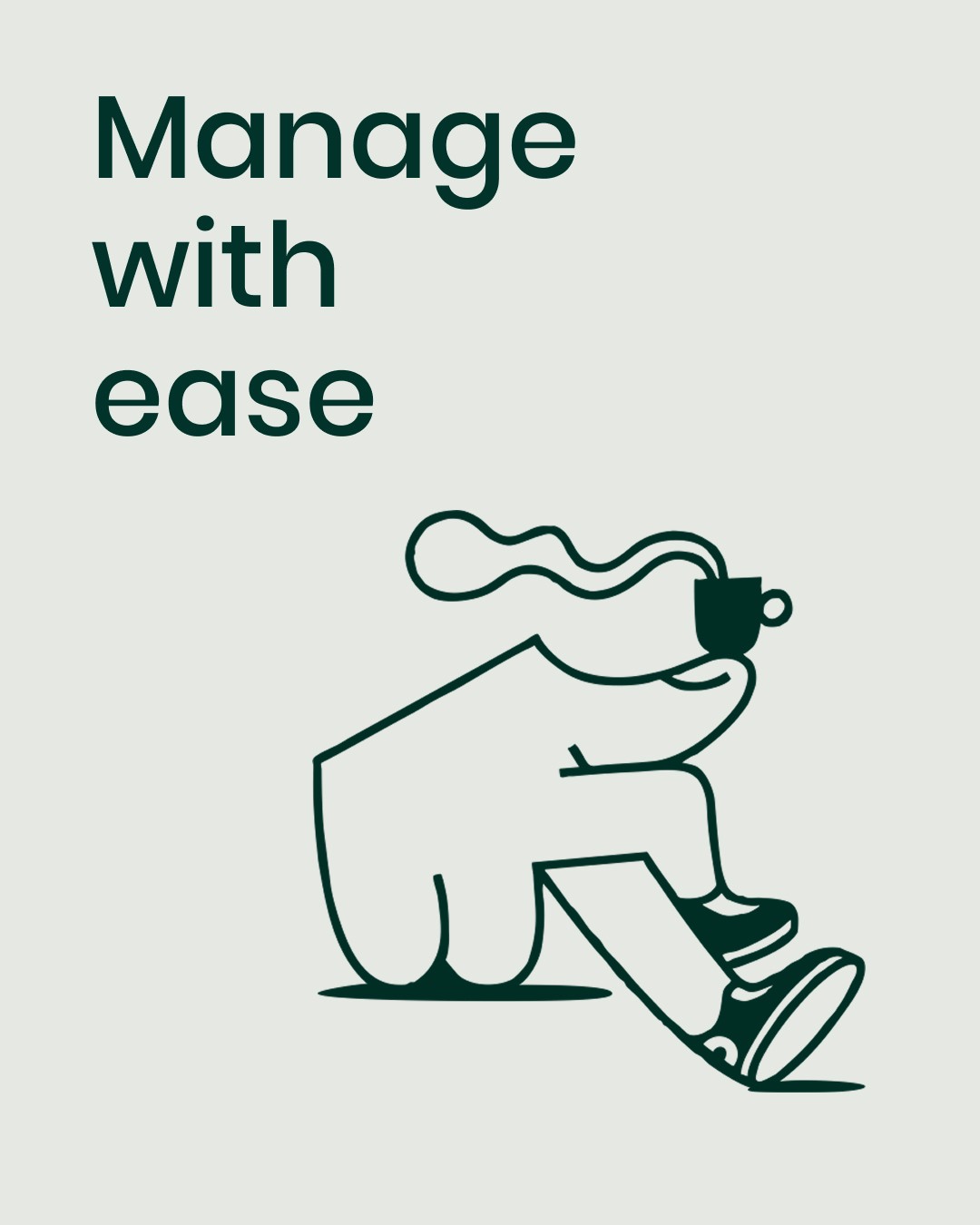
Usage
Captain’s mascots are a key part of the brand identity, adding personality and approachability. Each mascot is a finger figure with shoes, holding a specific pose to represent different moods or actions. They help support messaging, guide attention, and enhance brand personality.
Mascots should reinforce the message without overpowering other design elements. Placing them near key content, like call-to-action buttons or important text, helps direct focus. They can be used in marketing materials, social media, and product interfaces to create a playful yet professional tone.
Only official mascots should be used—no custom variations. They must always be placed against a background that ensures proper contrast and readability. Consistent use strengthens brand recognition and visual coherence.
Improper Usage
The mascot should always be treated with care and appear consistently across all surfaces. It must never be redesigned, altered, or modified in any way. By following these rules, the mascot will maintain its professional and recognizable appearance. Below are some examples of what not to do to ensure consistency:
Only use the mascot in dark green outlines
Only use the mascot in dark green outlines, do not color it in a different color as the background

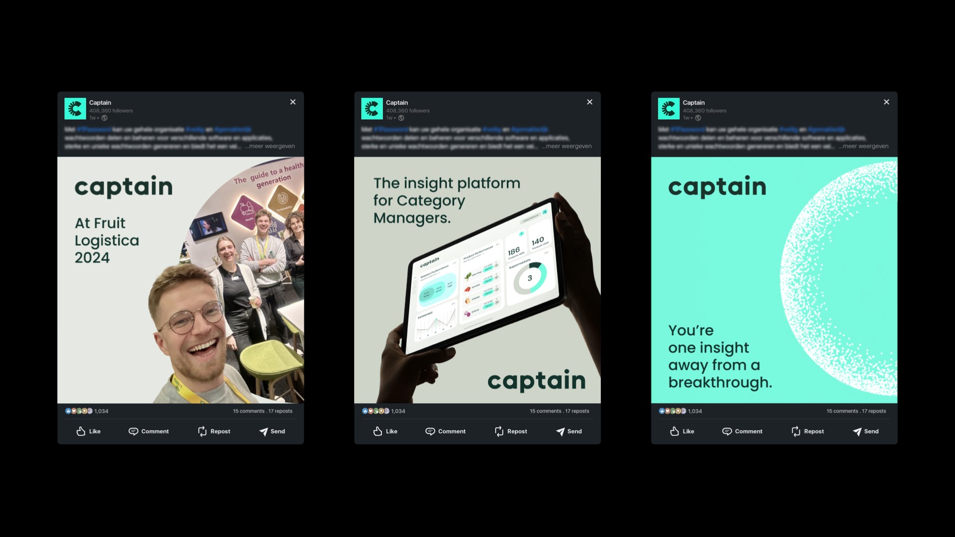
Examples


Downloads
Click the button below to download the graphics or mascot.
Can’t find what you’re looking for? Send an email to hello@offff.studio for assistance.