imagery
To convey a consistent feel within our brand identity, we have established a clear visual language, ensuring that even through imagery, we will be recognized as Captain. Our visual language is divided into 3 categories: Products, People and Devices.
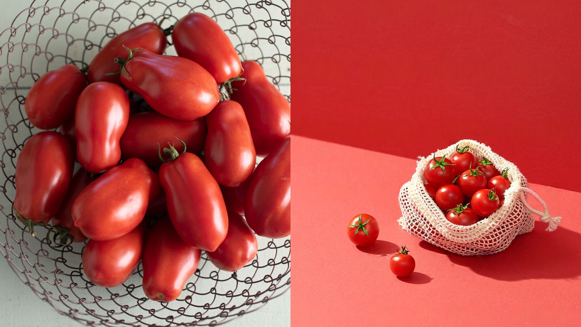
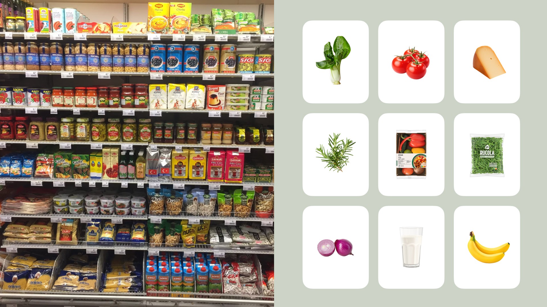
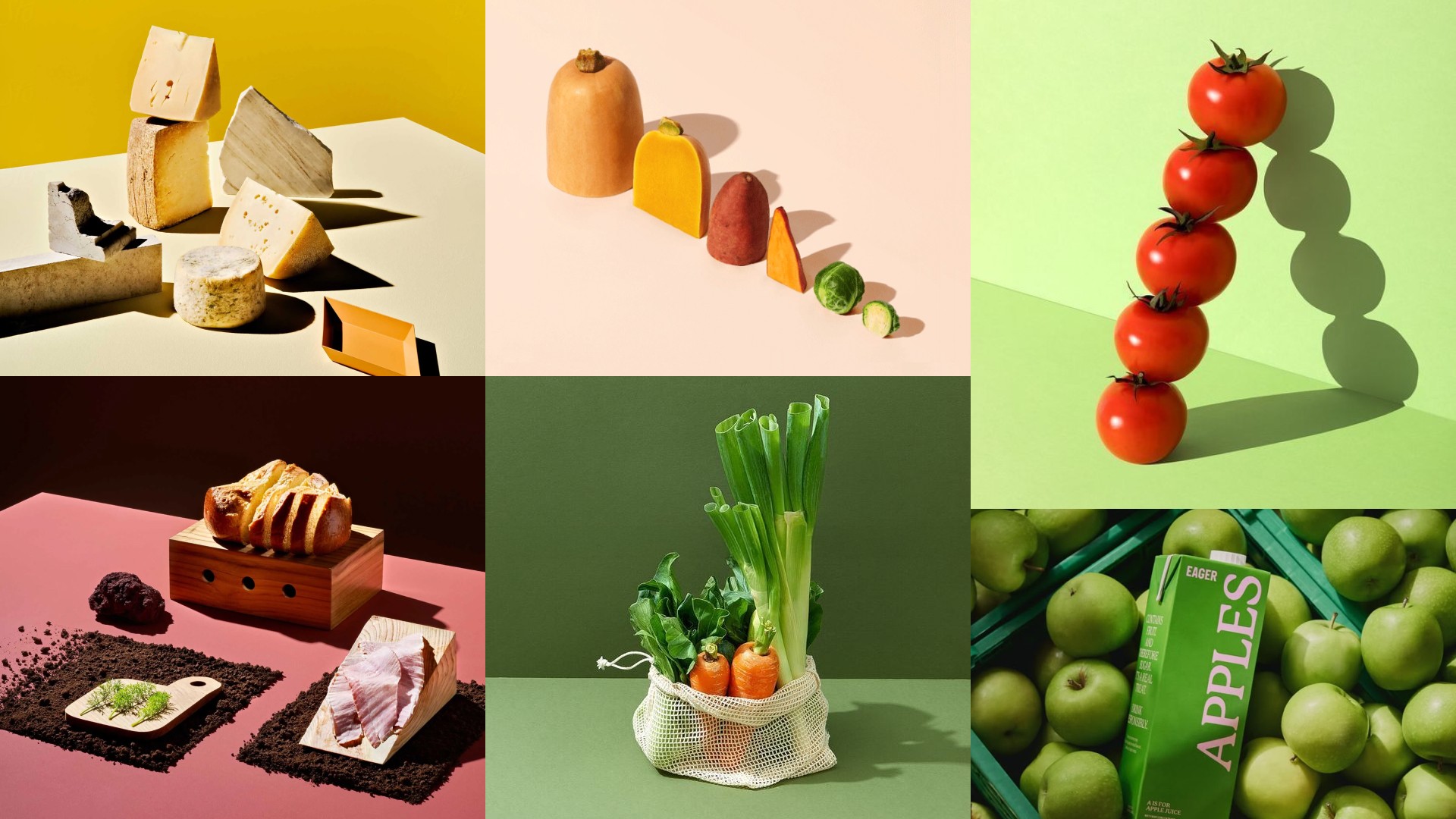
Products
We see the everyday products from an uplifting perspective, making the ordinary feel extraordinary. We make sure the hero always shines through in shots. When working with larger scenes, we create clarity with clutter-free, easy to read visuals.
Backgrounds and sets are often monochromatic, creating a studio feel. Color adds unmistakable intrigue to our expression. We’re careful and intentional with our combinations, keeping them to a minimum for maximum impact.
Incorrect
Correct
Examples
People
Our images feature unexpected and exaggerated shots of people (e.g., people floating, oversized objects, distorted perspectives). Playful distortions of everyday scenarios make the Captain experience feel magical and effortless. Humor is subtle but sophisticated, making the brand feel approachable.
Avoid using overly stock-like photography, we try to make our images as fresh as the brand itself. Our house style is drenched in optimistic, natural light. At the same time, high-contrast shadows or spotlights add a cinematic, editorial feel.
Incorrect
Correct

Examples

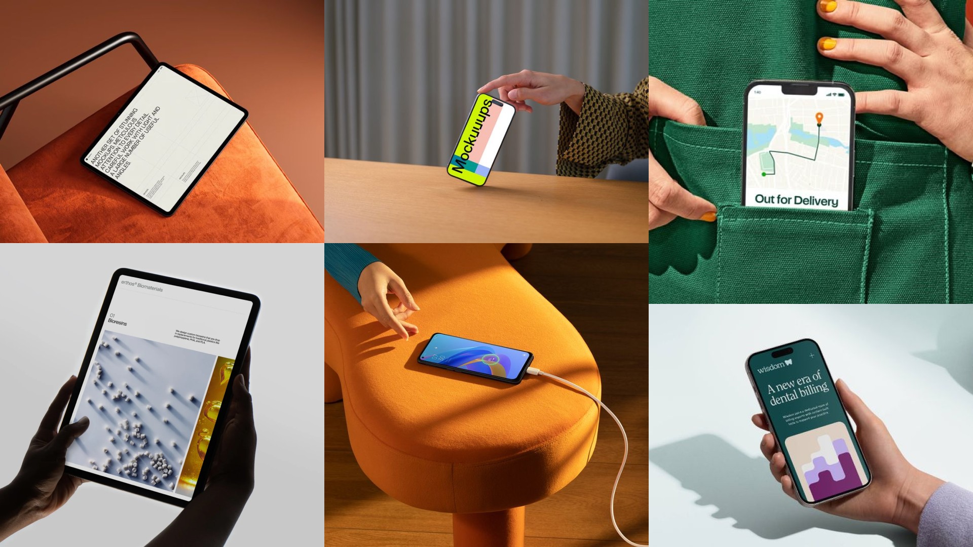
Devices
Getting our devices across in a clear, uncluttered way makes sure everyone enjoys the ride and lets the message or app features shine.
Incorrect
Correct

Examples
All images in the brand guidelines are inspirations to capture the guidelines messages. They cannot be used for any applications.
Can’t find what you’re looking for? Send an email to hello@offff.studio for assistance.