typography
Typography plays a crucial role in strengthening the visual identity of our brand. The carefully selected font ensures recognizability, consistency, and supports the message we want to convey.
Fonts
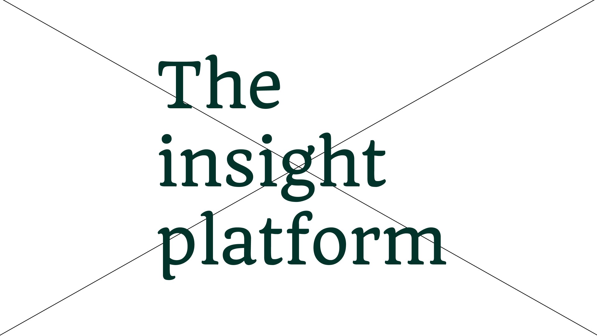
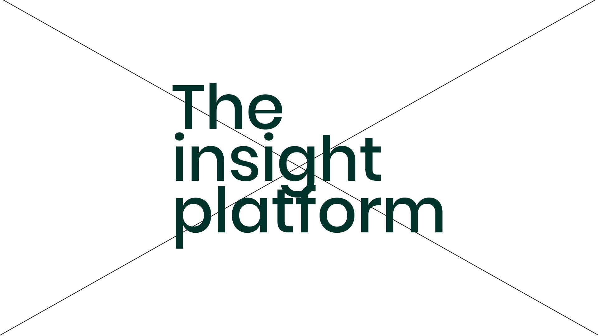
Poppins - Titles & Subtitles
Poppins is a modern, clean, and versatile sans-serif typeface with a geometric foundation. Its balanced proportions and minimalist design make it highly legible while maintaining a contemporary and professional appearance. This font can be used in regular case for headings or subheadings. Neither headings or subheadings should ever be used in uppercase.
We use this typeface exclusively in the medium weight. The medium weight adds just the right amount of boldness, ensuring strong readability and visual impact without feeling too heavy. This typeface aligns perfectly with the Captain aesthetic, reinforcing the brand’s high-end and sophisticated identity.
Poppins - Body & Buttons
Poppins is a clean and approachable sans-serif font with a subtle softness that enhances readability. Its balanced character shapes make it ideal for longer text passages, while its simplicity ensures clarity in smaller elements like buttons.
We only use Rigton in the book weight. This complements the boldness of Value Sans, creating a cohesive and polished typographic system that reinforces the brand’s modern and professional identity.
Usage
Hierarchy
Hierarchy between our typefaces is important. In the same document or composition, headings and subheadings should always be bigger than body text. If it’s not, then something is wrong.

Alignment
The preferred alignment is left-aligned. Use center alignment only in headings. When you combine headings with body text, do not use center alignment. Never use right-aligned or justified typography.
Sentence case
To maintain a professional appearance, we always start a sentence with a capital letter and end it with a period. The exception to this rule is for headings and subheadings, which can be written entirely in uppercase. For these, no period is required at the end.
Tracking
Tracking generally does not need to be adjusted for these typefaces. However, if you feel the need to increase the tracking for titles and subtitles, this is allowed.Limit tracking to a maximum of 1% or 20. The smaller the text size, the more likely it is that additional tracking may improve readability.
Leading
Heading leading should be generally tight. The safe option for all headings is 100%. However, if headings or subheadings are used in uppercase it allows a tighter leading. In this case we favour a leading of 90%. Body copy leading is optimised for maximum readability and accessibility. This should always be set at a minimum of 120%.
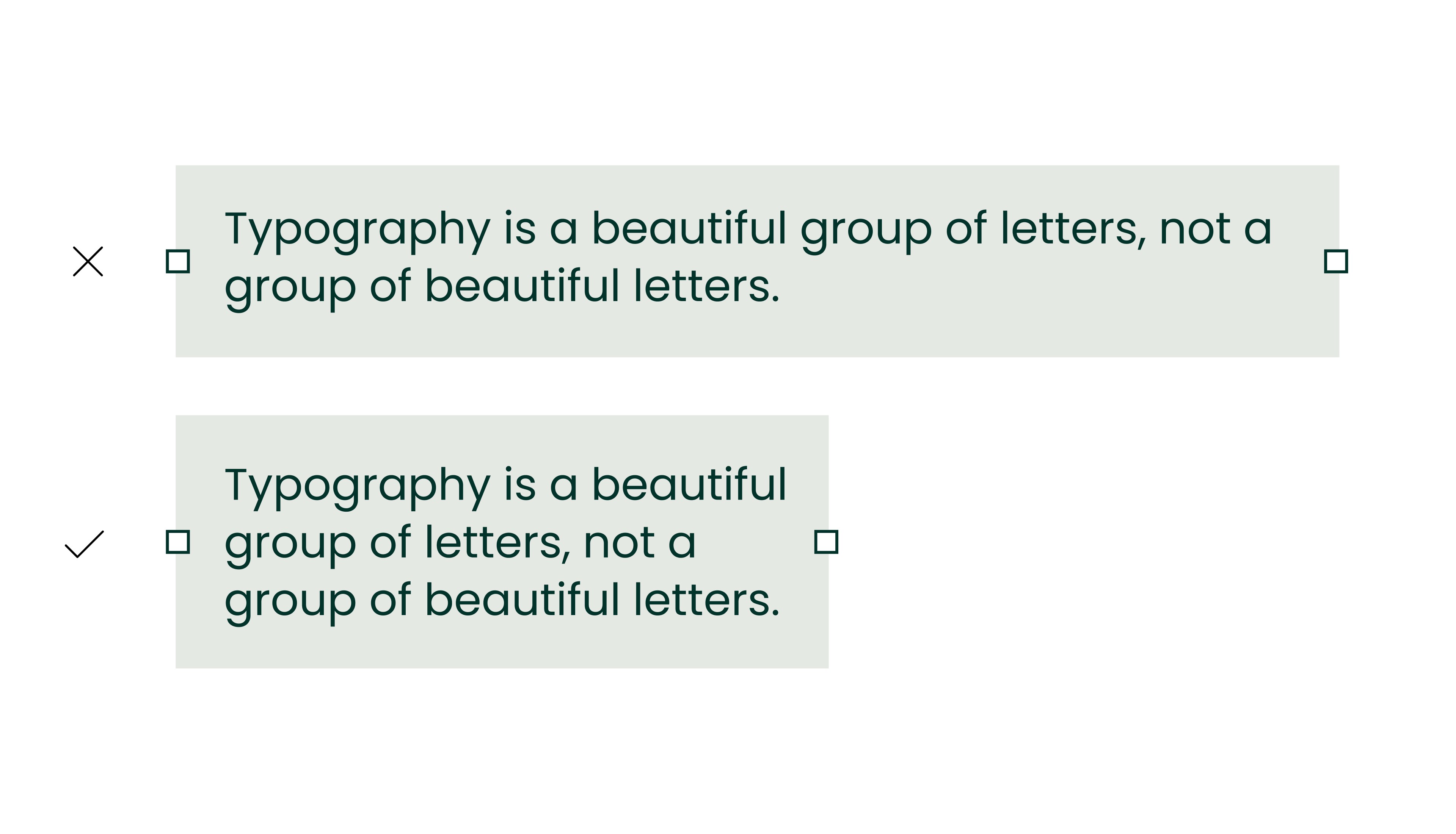
Hyphenation
Try to avoid hyphenation in titles and paragraphs. Think of typography as a beautiful group of letters, not a group of beautiful letters.
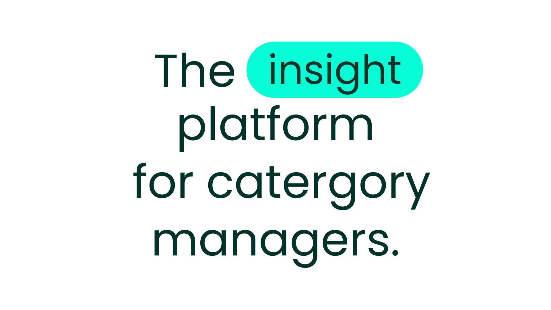
Highlight
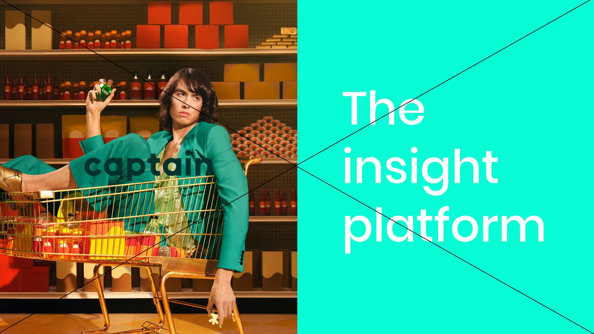
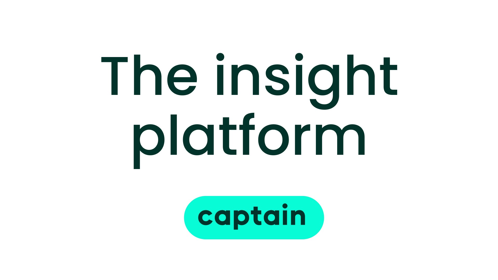
Sometimes, a single word holds more significance than others. To emphasize it, use our bright turquoise as a highlight. Instead of directly coloring the text, place it within a pill-shaped background (also called a “bubble”) to ensure readability and maintain design consistency. The size of the text inside the pill should be slightly reduced.
Correct way of highlighting
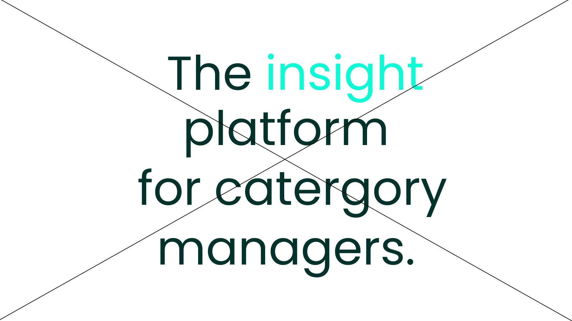
Do not highlight by changing the text color.
Contrast
Always maintain sufficient contrast to ensure clarity and legibility. When using a light background, choose a dark color for text. If the background is an image with inadequate contrast, place the logo or text within a “bubble” or container to enhance readability.
Correct contrast
Incorrect contrast
Maintain a clear hierarchy by varying the sizes of the logo and text.
Example of good hierarchy. Avoid making them the same size to ensure clarity and impact.
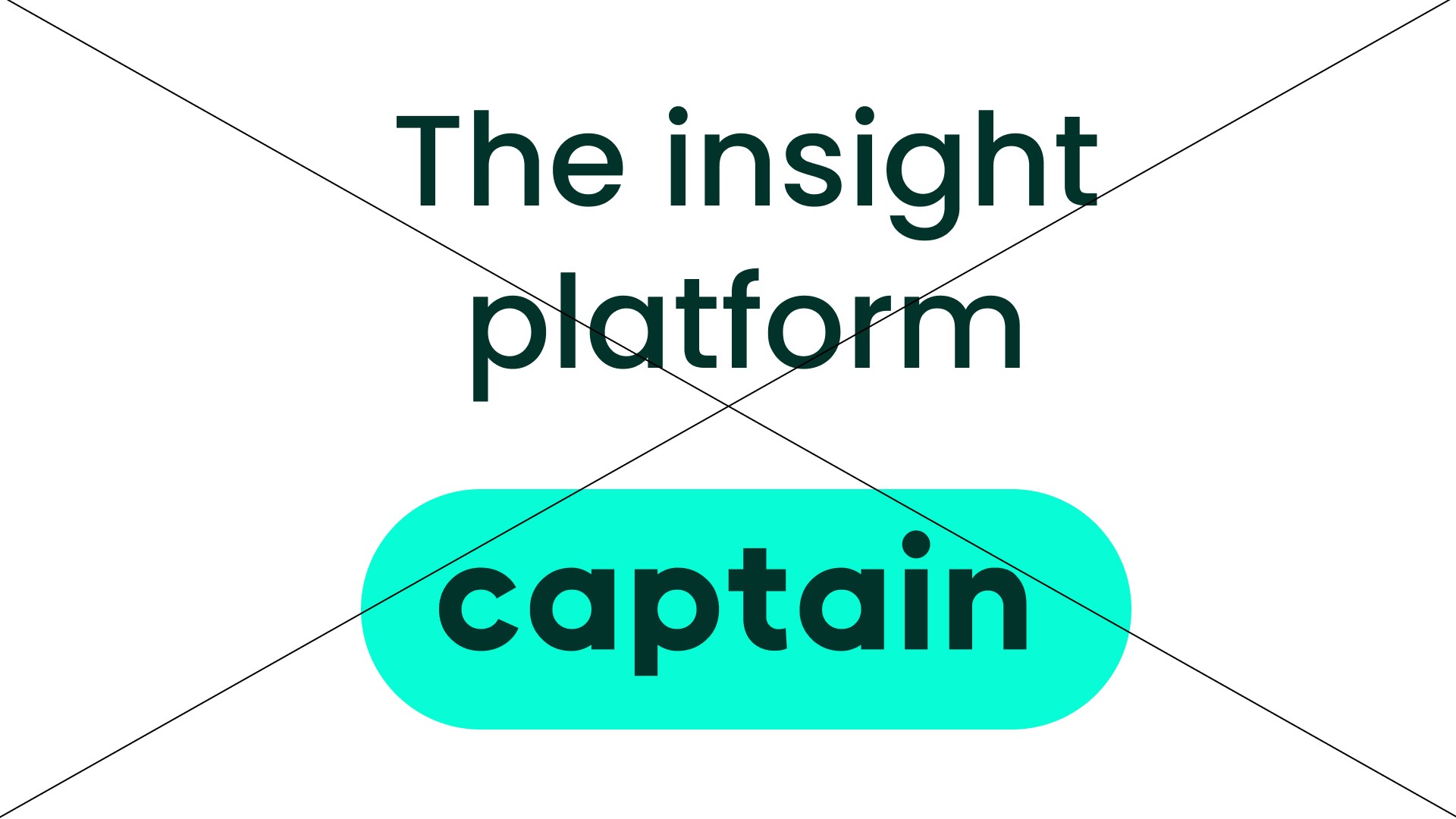
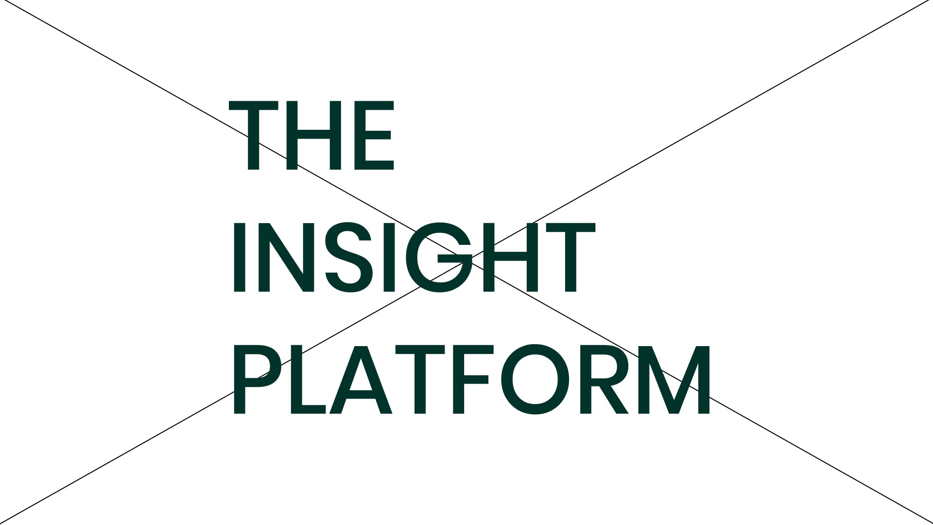
Don'ts
Below are some examples that should always be avoided when setting type. Sometimes, issues may arise that are not covered in these examples. In such cases, refer to the guidelines and use your common sense. Look for solutions that align with the overall brand identity.
Do not use all caps.
Do not use title case.

Do not use alternative typefaces
Do not let type touch.
Do not use large line lenght's.
Do not use right-aligned type.
Do not use to much negative or positive tracking.
Do not use outline on or apply dropshadow to type.
Examples
Downloads
Click the button below to download the fonts. To use these fonts legally, they must be purchased under the correct license.
Poppins is licensed by Google.
Can’t find what you’re looking for? Send an email to hello@offff.studio for assistance.